Why is the bell curve so pervasive?
Why do so many things seem to be normally distributed (bell curved)? That's something that bothered me for a long time. Human heights are (roughly) normally distributed. So are are weights of (presumably identical) bags of potato chips, basketball scores, blood pressure, and a million other things, seemingly unrelated.
Well, I was finally able to "figure it out," in the sense of, finding a good intuitive explanation that satisfied my inner "why". Here's the explanation I gave myself. It might not work for you -- but you might already have your own.
------
Imagine a million people each flipping a coin 100 times, and reporting the number of heads they got. The distribution of those million results will have a bell-shaped curve with a mean around 50. (Yes, the number of heads is discrete and the bell curve is continuous, but never mind.)
In fact, you can prove, mathematically, that you should get something very close to the normal distribution. But is there an intuitive explanation that doesn't need that much math?
My explanation is: the curve HAS to be bell-shaped. There's no alternative based on what we already know about it.
-- First: you probably want the distribution to be curved, and not straight lines. I guess you could expect something kind of triangular, but that would be weird.
-- Second: the curve can never go below the horizontal axis, since probabilities can't be negative.
-- Third: the curve has to be highest at 50, and always go lower when you move farther from the center -- which means, at the extremes, it gets very, very close to zero without ever touching it.
That means we're stuck with this:

How do you fill that in without making something that looks like a bell? You can't.
This line of thinking -- call it the "fill in the graph" argument -- doesn't prove it's the normal distribution specifically. It just explains why it's a bell curve. But, I didn't have a mental image of the normal distribution as different from other bell-shaped curves, so it's close enough for my gut. In fact, I'm just going to take it as a given that it's the normal distribution, and carry on.
(By the way, if you want to see the normal distribution arise magically from the equivalent of coin flips, see the video here.)
-----
That's fine for coin flips. But what about all those other things? Say, human height? We still know it's a bell-shaped curve from the same "fill in the graph" argument, but how do we know it's the same one as coins? After all, a single human's height isn't the same thing as flipping a quarter 100 times.
My gut explanation is ... it probably *is* something like coin flips. Imagine that the average adult male is 5' 9". But there may be (say) a million genes that move that up or down. Suppose that for each of those genes, if it shows "heads," you get to be 1/180 of an inch taller. If the gene shows "tails," you're 1/180 of an inch shorter.
If that's how it works, and each gene is independent and random, the population winds up following a normal distribution with a standard deviation of around 2.8 inches, which is roughly the real-world number.
It seems reasonable to me, intuitively, to think that the genetics of height probably do work something like this oversimplified example.
-----
How does this apply to weights of bags of chips? Same idea. The chips are processed on complicated machinery, with a million moving parts. They aren't precise down to the last decimal place. If there are 1,000 places on the production line where the bag might get a fraction heavier or lighter, the coin-flip model works fine.
-----
But for test scores, the coin-flip model doesn't seem to work very well. People have different levels of skill with which they pick up the material, and different study habits, and different reactions to the pressure of an exam, and different speeds at which they write. There's no obvious "coin flipping" involved in the fact that some students work hard, and some don't bother too much.
But there can be coin flipping involved in some of those other things. Different levels of skill could be somewhat genetic, and therefore normally distributed.
And, most of those other things have to be *roughly* bell-shaped, too, by the "fill in the graph" argument: the extremes can't go below zero, and the curve needs to drop consistently on both sides of the peak.
So to get the final test result, you're adding the bell-shaped curve for ability, plus the bell-shaped curve for speed, plus the bell-shaped curve for industriousness, and so on.
When you add variables that are normally distributed, the sum is also normally distributed. Why? Well, suppose ability is the equivalent of the sum of 1000 coin flips. And industriousness is the equivalent of the sum of 350 coin flips. Then, "ability plus industriousness" is just the sum of 1350 coin flips -- which is still a bell curve.
My guess is that there are a lot of things in the universe that work this way, and that's why they come out normally distributed.
If you want to go beyond genetics ... well, there are probably a million environmental factors, too. Going back to height ... maybe, the more you exercise, the taller you get, by some tiny fraction. (Maybe exercise burns more calories, which makes you hungrier, and it's the nutrition that helps you get taller. Whatever.)
Exercise could be normally distributed, too, or at least many of its factors might. For instance, how much exercise you get might partly depend on, say, how far you had to walk to school. That, itself, has to roughly be a bell curve, by the same old "fill in the graph" argument.
------
What makes bell curves even more ubiquitous is that you get bell curves even if you start with something other than coin flips.
Take, for instance, the length of a winning streak in sports. That isn't a coin flip, and it isn't, itself, normally distributed. The most frequent streak is 0 wins, then 1, then 2, and so on. The graph would look something like this (stolen randomly from the web):

But, the thing is: the distribution of one winning streak doesn't look normal at all. But if you add up, say, a million winning streaks -- the result WILL be normally distributed. That's the most famous result in statistics, the "Central Limit Theorem," which says that if you add up enough identical, independent random variables, you always get a normal curve.
Why? My intuitive explanation is: the winning streak totals reflect, roughly, the same underlying logic as the coin flips.
Suppose you're figuring out how to get 50 heads out of 100 coins. You say, "well, all the odd flips might be heads. All the even flips might be heads. The first 50 might be heads, and the last 50 might be tails ... " and so on.
For winning streaks: Suppose you're trying to figure out how to get a total of (say) 67 wins out of 100 streaks. You say, "well, maybe all the odd streaks are 0, and all the low even streaks are 1, and streak number 100 is a 9-gamer, and streak number 98 is a 7-gamer, and so on. Or, maybe the EVEN streaks are zero, and the high ODD streaks are the big ones. Or maybe it's the LOW odd streaks that are the big ones ... " and so on.
In both cases, you calculate the probabilities by choosing combinations that add up. It's the fact that the probabilities are based on combinations that makes things come out normal.
------
Why is that? Why does the involvement of combinations lead to a normal distribution? For that, the intuitive argument involves some formulas (but no complicated math).
This is the actual equation for the normal distribution:
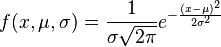
It looks complicated. It's got pi in it, and e (the transcendental number 2.71828...), and exponents. How does all that show up, when we're just flipping coins and counting heads?
It comes from the combinations -- specifically, the factorials they contain.
The binomial probability of getting exactly 50 heads in 100 coin tosses is:
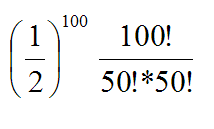
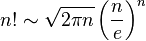
It's only strictly equal as n approaches infinity, but it's very, very close for any value of n.
Stick that in where the factorial would go, and do some algebra manipulation, and the "e" winds up flipping from the denominator to the numerator, and the "square root of 2 pi" flips from the numerator to the denominator ... and you get something that looks really close to the normal distribution. Well, I'm pretty sure you do; I haven't tried it myself.
I don't have to ... at this point, my gut is happy. My sense of "I still don't understand why" is satisfied by seeing the Stirling formula, and seeing how the pi and e come out of the factorials in roughly the right place.
(UPDATE, 3/8/2015: I had originally said, in the first paragraph, that test scores are normally distributed. In a tweet, Rodney Fort pointed out that they're actually *engineered* to be normally distributed. So, not the best example, and I've removed it.)
Labels: bell curve, normal distribution, statistics
posted by Phil Birnbaum @ 3/06/2015 02:12:00 PM
11 comments


